Overview
- Background: Our app’s welcome screen was in need of a facelift. Feedback from users indicated that the app experience was repetitive and failed to capture their interest. To increase engagement, we updated the icons and visual treatment to have a more modern look and feel, and added additional content. We also restructured the information architecture to be less redundant and more intuitive for our users.
- Duration: February - March 2021 (1.5 months)
- Status: Launched 🚀
- My Role: Lead Product Designer
- Team: Oversaw the work of 2 other product designers. Collaborated with Product Managers, Front-end Developers, and our Brand/Marketing team.
- Activities: Competitive Analysis, Information Architecture, Wireframing, User Testing, UX/UI Design
- Tools:
 Figma
Figma Userzoom
00. Design process
Overview of our process from concept to launch.
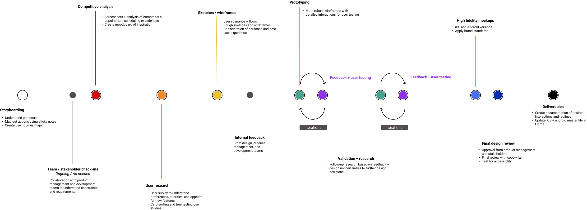
01. Storyboarding
We started off by thinking about our users and what their ideal journey would be through the new welcome screen experience. To gain better understanding and empathy, we selected Brad, our “Self-sufficient” persona and the target user for our mobile app, to base our journey map on.
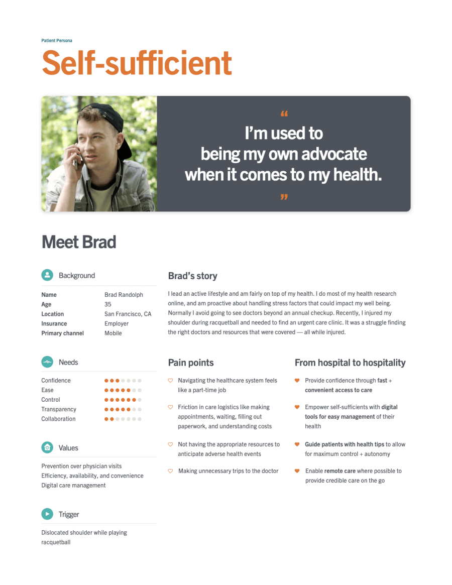
We used sticky notes to lay out Brad’s actions, thoughts, and feelings throughout several scenarios.

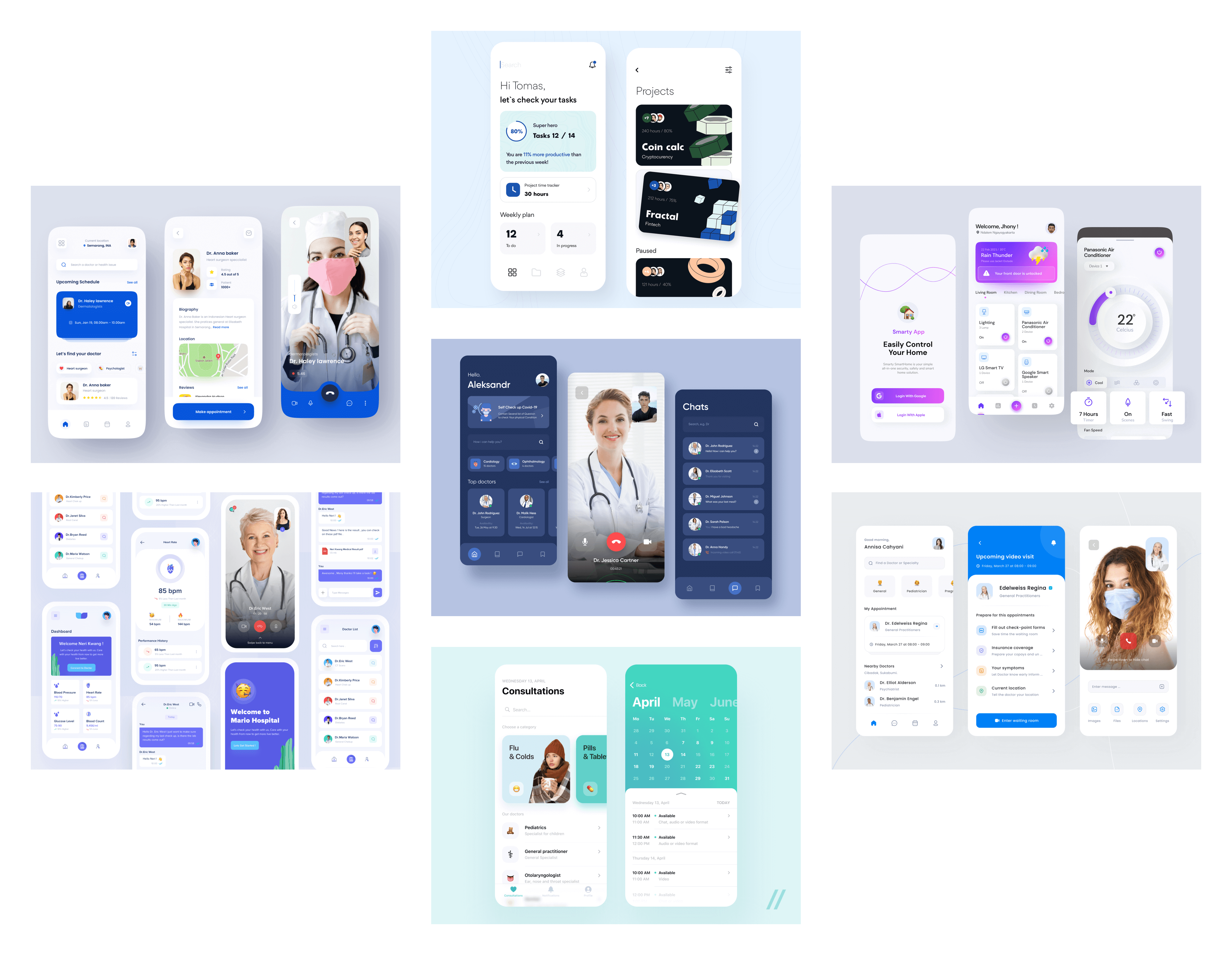
02. Competitive analysis
Before beginning design, we conducted a competitive analysis of healthcare apps’ and some of our own personal favorite apps’ homescreen designs. We discovered a trend towards interactive graphical elements and using blocks and cards to organize information, creating a visually appealing hierarchy.
03. User research + IA
We used UserZoom to conduct several user studies:
- A survey to understand user preferences, priorities, and appetite for new features
- A card sort to help us understand how users would organize features and information
- A tree test to validate our proposed information architecture
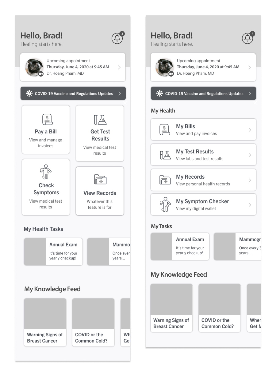
Using the results from the user survey and card sort study, we proposed several new information architecture structures for our app's bottom navigation.
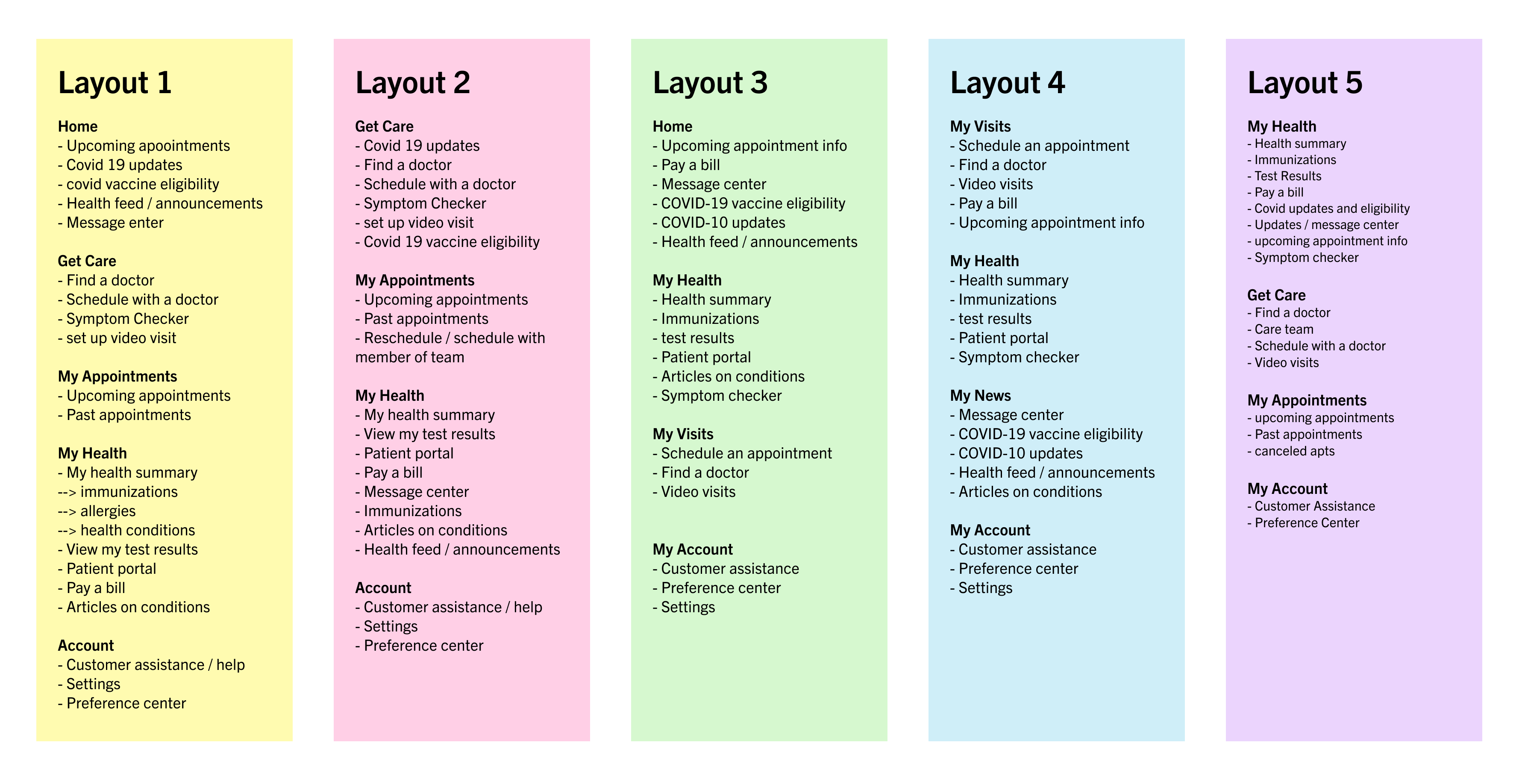
We validated these options through several tree test user studies, and ultimately chose Layout 5 as it performed the best amongst users.
04. Wireframing
Layout exploration
Taking inspiration from our moodboard, we sketched out several layout variations that were more modern and card-based.
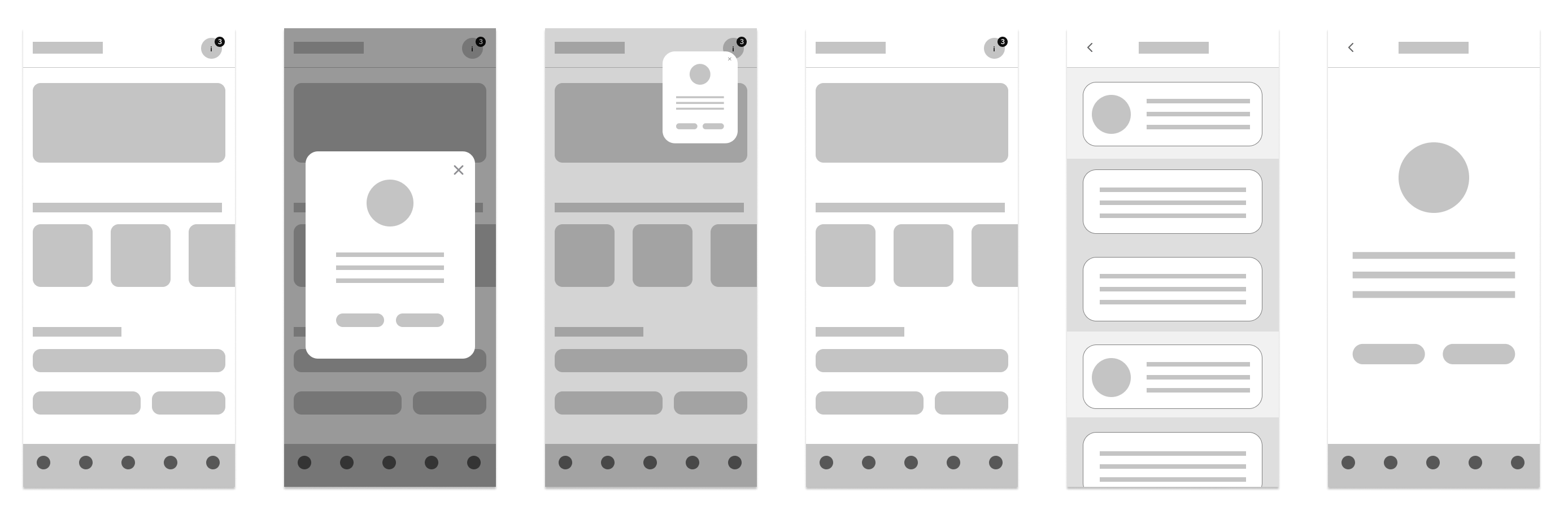
Detailed wireframes
We created more detailed wireframes based off our initial sketches.
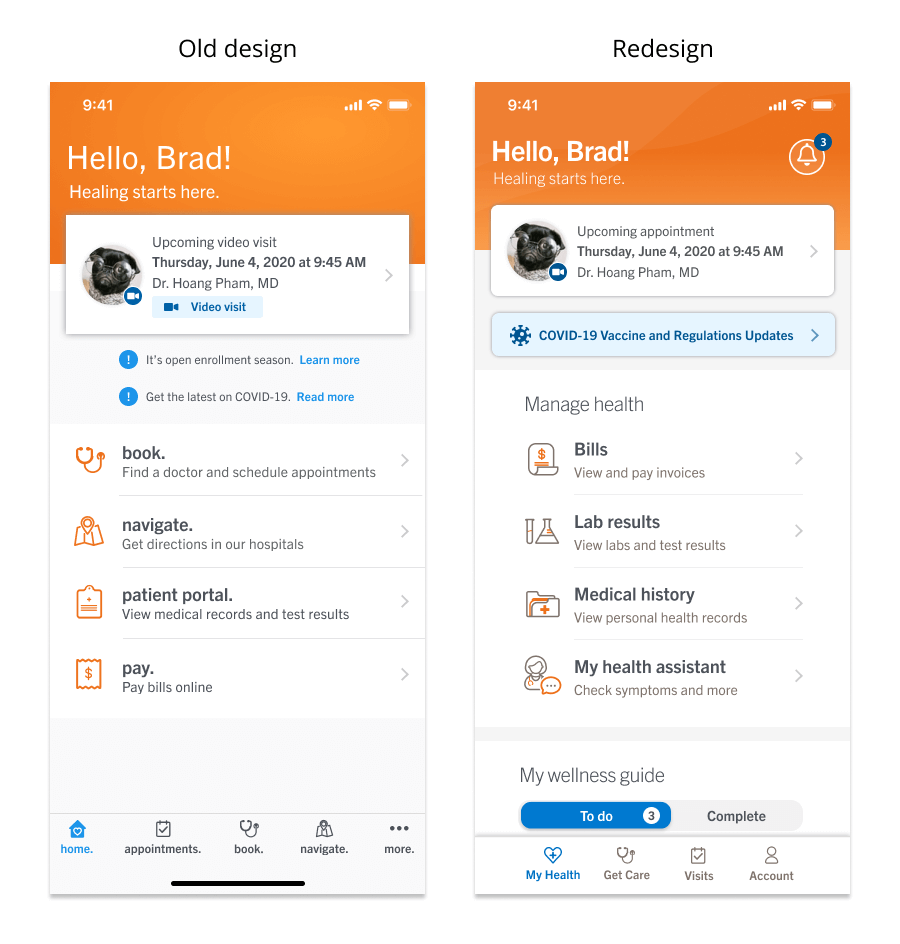
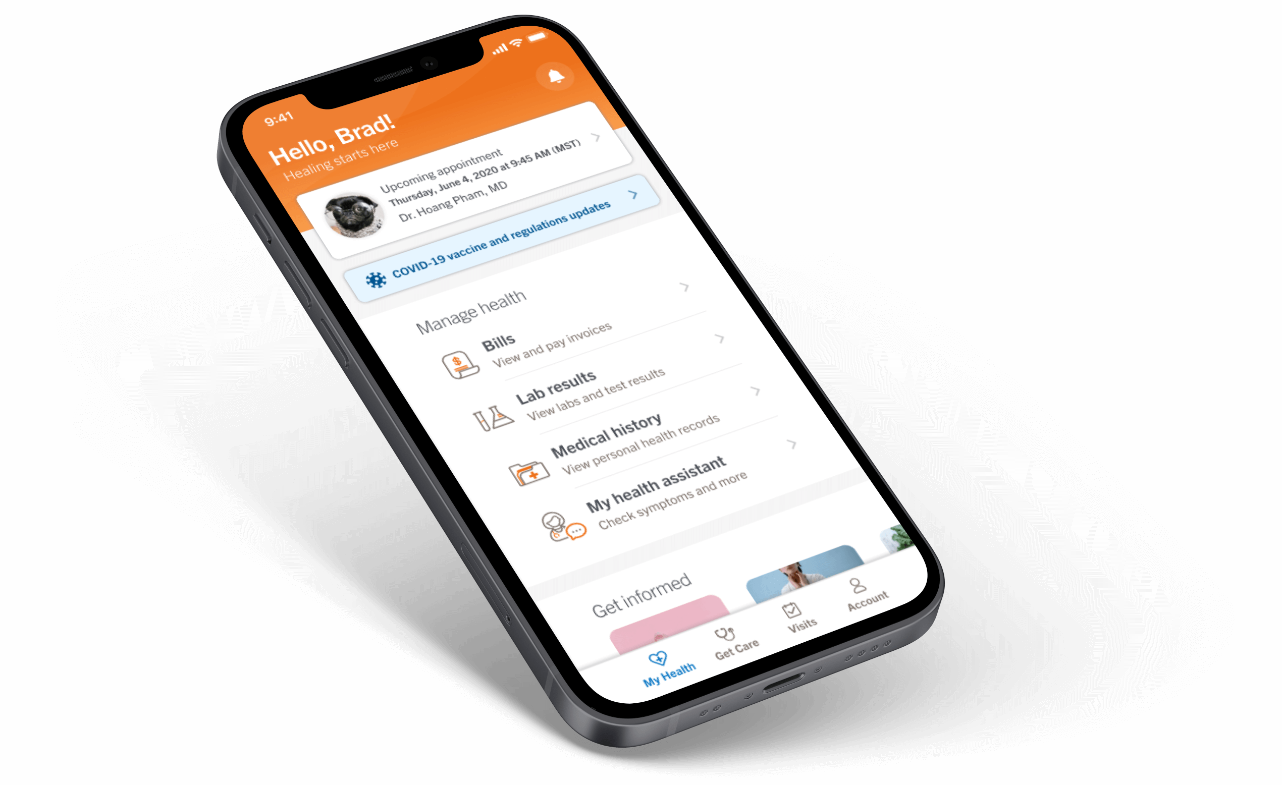
05. High-fidelity mocks
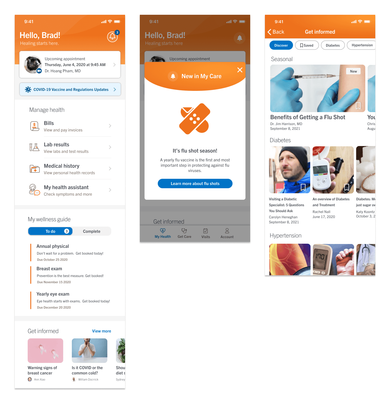
Our final deliverables included a redesigned welcome screen with a revamped look and feel and new features to increase engagement.
Visual updates:
- Subtle gradient shapes in the hero/header section to add visual interest without being overpowering
- Two-tone icons to convey a more modern and approachable feel
New features:
- Wellness guide with actionable to-do’s
- “Get informed” section for users to browse relevant articles based on their health conditions
06. Development hand-off
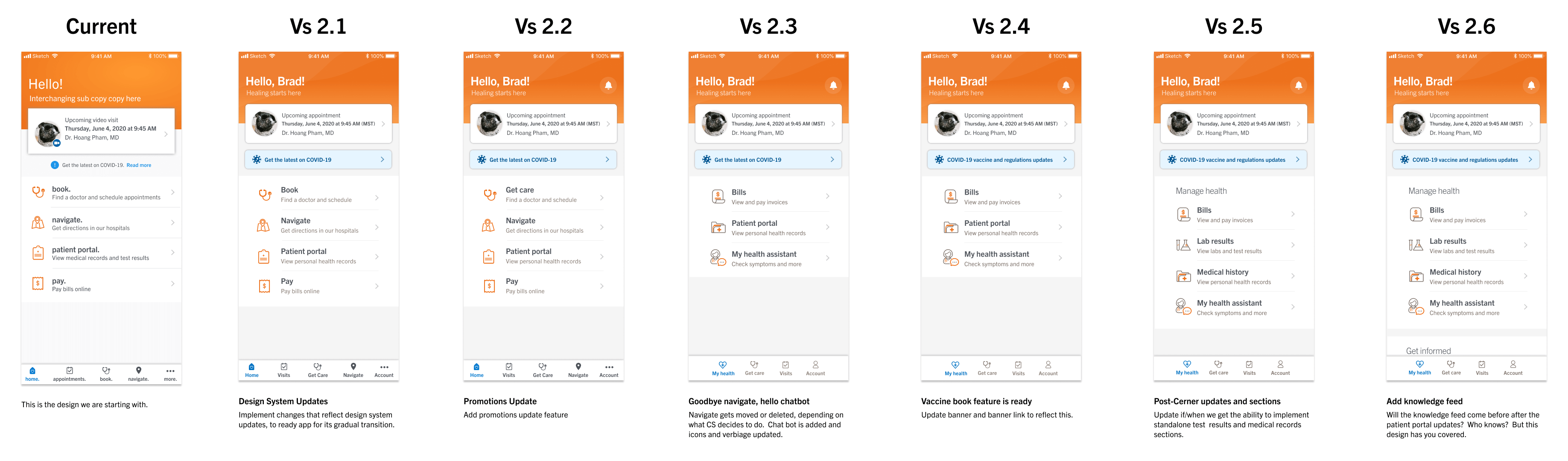
We created a detailed iteration guide to help our developers understand how to move incrementally from the previous design to the new redesign.
Conclusion
The redesigned welcome screen applies more modern styling while still adhering to our brand principles. It improves user engagement and navigability through the app with a more intuitive information architecture and bottom navigation bar.